We wrote this post a few years ago but we believe that it still holds true. Color has always held a fascination for us and it’s a key element in the design process. And just for interest, here’s the Pantone Color of the Year for 2020: 😁
One of the key elements in fashion design is color and late 19th Century fashion design is no exception. The design process may vary between individual designers but no matter who they are, they all have to consider what colors they’re going to use in their designs. The selection of colors is dependent on the season (though not always) and as such, tend to follow nature. Today, heavy weight is given to predicting what colors will be popular with fashion consumers because this influences the color and types of fabrics that design houses will order for their new lines; a multi-million dollar industry has been created around predicting what colors will be in for the following year with Pantone being the leading firm because of it setting color standards for a variety of industries.. The following color palettes from Pantone give a good illustration of this:
First we have the palette for Spring 2018:

Just for comparison, here’s the Spring 2020 Color palette (in some ways, it seems to be a close re-rum of the 2018 palette):
In the above palette for 2018 and 2020, the colors tend to be lighter, reflecting the increasingly longer days, more sunny weather, and new growth of plants and foliage.
However, before we go on, let us note that color trend prediction is a somewhat subjective and as such, it doesn’t always follow strict rules and as such, it’s more of an approximation today than it was during the 19th Century. Here are two examples from the late 19th Century:


As with other designers, consideration of color makes up a good part of the design process and it’s one of the first steps in the design process. For us, colors fall under three major categories: Fall, Winter, and Spring/Summer. At the same time, we also consider what sort of a garment we’re designing: ball gown, day dress, reception dress, etc. Also, we consider where it’s primarily going to be worn: outside, indoors, indoors at night (e.g., ball room, stage, etc.). Once those questions are answered, we can then proceed with more specific color selections. If the garment is to be worn during the daytime and outside, we tend to first use nature as the first starting point for inspiration.
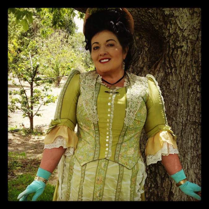
To illustrate this, let’s consider our Camille picnic dress design. When we originally conceived of it, we were looking for a day dress that could be worn at an outdoor event in the Spring or Summer such as a picnic. The Mid-Bustle Era has always been a favorite with us, so we decided that the style would derive from that period. From there, we determined our color palette, drawing inspiration from the Impressionist painters and Claude Monet in particular. But even more specifically, we wanted to emphasize the Spring with its fresh vegetation and explosion of lighter green colors combined with occasional pops of red or violet and towards that end, Monet’s garden at Giverny was the perfect source of inspiration. After some online photo research, here’s what we came up with:

Ultimately, the decision was made to go with a bright chartreuse as the primary color based on the greenery found at Giverny that’s portrayed with in Monet’s paintings as well as actual photographs such as this one:

Giverny Today
Below are a few more illustrations of the final Camille picnic dress just to give an idea of how the color was ultimately brought to life:


From a color theory standpoint, the colors that we ultimately used for the Camille picnic dress were: chartreuse (both pale and bright), pale champagne gold (on the lower sleeves), and yellow-orange (the fringed trim running on the skirt front):


Finally, if viewed on the color wheel, you will notice that they are all analogous colors that are located next to each on the wheel:

We hope you’ve enjoyed that this post has helped give you some insight into just one of the many elements that go into making a Lily Absinthe design.

