And It’s That Time Again- Lily Absinthe Goes To The FIDM Museum, Part 1

12th Annual Art of Television Costume Design

Today we decided to avail ourselves of a last opportunity to view the 12th “Outstanding Art of Television Costume Design Exhibit” at the FIDM Museum in Los Angeles and while we had to deal with some large crowds, it was definitely worth the time. As a general thing, we like the costume exhibits that are put on at the FIDM Museum because the location is convenient, parking is relatively easy to find, and the admission is free. Yes, free! 🙂

FIDM Adam

Getting in a quick picture between mods of visitors…

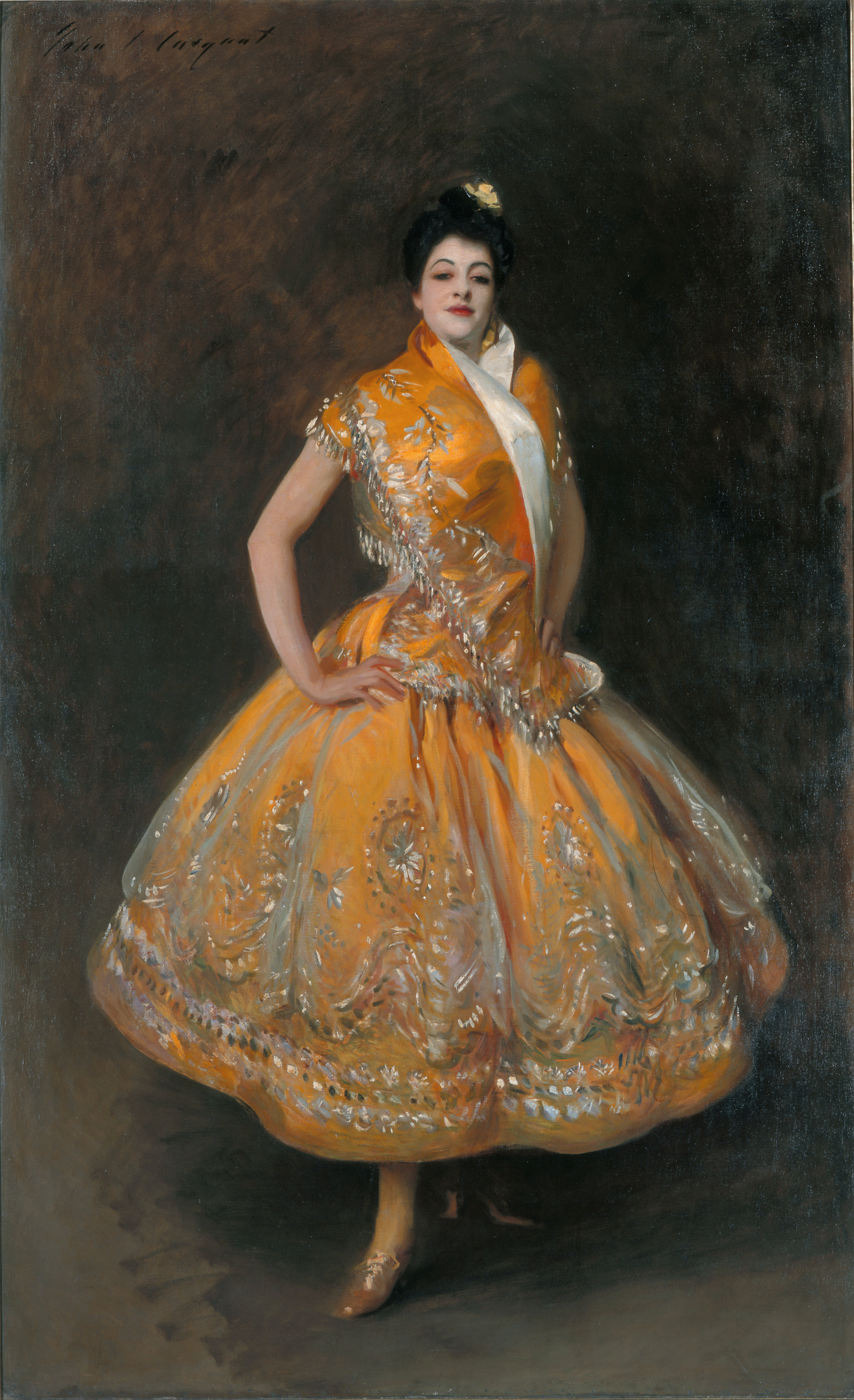
Although we tend to focus on shows set in the late 19th and early 20th Centuries, we’re not oblivious to other eras and genres and upon entering we were greeted by some artfully designed outfits from the show The Marvelous Mrs. Maisel:

20180929_110407.jpg

20180929_110417.jpg

20180929_110413.jpg

While 1950s fashions may seem to be light years apart from the late 19th Century, they both share the characteristic of carefully sculpted silhouettes (helped along by proper foundation garments) and as such represent the design ethos of careful, deliberate design effects, something that was not to re-emerge until the 1980s (albeit in a somewhat re-worked form).

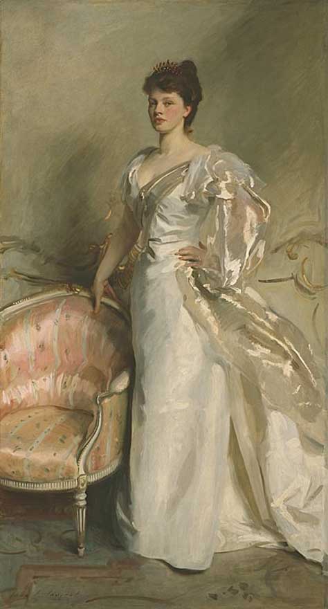
Next, were the costumes from The Alienist. We’ll start with the men’s outfits:

FIDM Museum

The above is a fairly functional sack suit and it pretty much fits for 1896 although there’s a couple of details that we find questionable. First, the use of bright colored and/or patterned silks, wools, and cottons for vest fronts was more of an 1860s style and by the 1890s, fabrics tended towards more conservative patterns and colors, often matching the rest of the sack suit (but not always). Second, the use of insets on the collar/lapels is somewhat questionable- from the extant period examples we’ve examined, this seemed to have been a style element reserved for more formal frock and tail coats. Perhaps this was an attempt to emphasize the character John Moore’s upper class status.

Next, we see a frock coat suit worn by Dr. Lazlo Kriezler:

20180929_110823.jpg

20180929_110826.jpg

The use of a bottle green wool is interesting in that it’s a little outside of the norm but not implausibly so and the silhouette holds up well. The button holes on the collar is an odd embellishment but it’s hard to notice on screen.

Image result for the alienist

Daniel Brühl, Dakota Fanning and Luke Evans in *The Alienist*

And now for the women’s costumes, at least those worn by Dakota Fanning as Sara Howard. First up is a day dress:

 20180929_110853.jpg

20180929_110900.jpg

In terms of silhouette, this dress follows a fairly conventional 1890s day dress style and the silk brocade fashion fabric suggests a better sort of afternoon/visiting dress. However, the sleeves seem to be lacking for a dress that’s supposed to date from 1896. The mid-1890s saw the gigot, or leg-of-mutton, sleeve in full boom and for the most part, had far more fullness than what’s on this dress. Granted, some gigot sleeve styles could get seriously over the top but nevertheless, for a dress worn by someone of means, this is not an area that would have been skimped on; these just appear perfunctory. Finally, in its defense, the plum and magenta color combination is an excellent one and the hats further enhances this although the hat doesn’t appear to have been worn, at least to the best of our recollection (somehow, when it comes to film and TV, hats are usually the first thing to be discarded).

Final note: When we first viewed this costume at the FIDM Museum, we noticed that the bottom of the bodice was unbuttoned. We thought this was some attempt to model the bodice details but when we found the above picture, we saw that it had been worn that was in the production. The only reaction we can summon is NO. These dresses were meant to be work with all the fasteners closed; it simply doesn’t read correctly. Perhaps there was a fit issue that prevented full closure and there was no time to fix it but still, it’s simply sloppy.

Next, we seen an evening dress:

20180929_110847.jpg

Due to the crowds, I was unable to get a good frontal view so here are a few additional ones that we found online:

Alienist_Evening Dress1 1896

The concept illustration.

Image result for the alienist costumes

One interesting thing we noticed with this evening dress was that the bodice included spaghetti straps in the production but this was lacking in the actual garments when it was on display. Style-wise this evening dress does give a very rough 1890s silhouette but that’s about all that’s 1890s about it. The worst element is the pleated bodice- the pleats are not only not historically correct, but they make the bodice look ill-fitting. The sleeve and neck treatment also don’t help- The strips of velvet swags are loosely tacked onto the bodice front and limply hang off the shoulders with no attempt to really follow the wearer’s silhouette. The overall effect just looks sloppy. Finally, no real attempt was made to properly create the gored skirts that were the basic element of any 1890s evening dress:

20180929_110907.jpg

Here we see a loose gathering of fabric. Once again, sloppy. Just for comparison, let’s take a look at an original evening dress circa 1892 – 1896 that features a pleated bodice:

Evening Dress c. 1892 - 1896

M. Laferriere, Robes et Mantaux, Evening Dress, c. 1892 – 1896; Kent State University Museum (1983.001.0173)

Evening Dress c. 1892 - 1896

Evening Dress c. 1892 - 1896

Close-Up, Rear View

Evening Dress c. 1892 - 1896

While style elements may vary, the key is that the total dress is tidy with smooth lines. Nothing appears to have been added without purpose. Now, perhaps the rumpled bodice in the production was hiding a lack of corseting (can’t say for sure here but often leading actresses insist on not wearing corsets in productions and usually the director will go along with it, even though it ruins the bodice silhouette).

In contract to the ball down is this walking suit that unfortunately got almost no air time:

FIDM Museum

20180929_111000.jpg

Overall, the silhouette reads mid-1890s and the construction is excellent, especially in lining up the stripes between the sleeves and cuffs. The jacket/skirt/waist combination was very characteristic of 1890s day wear and the costume designer definitely got it right. The only issue is, like the above day dress, is the sleeves- they could have been larger, extending out from the shoulder more.

The Alienist

Overall, it was a commendable attempt and definitely deserves recognitiion. Well, that’s it for now- we’ll have more soon.

(To be continued…)

And Now Back To The 70s…

The 1870s, that is! 🙂 Below is one extremely interesting example of  Early Bustle Era style from circa 1872-1875 that epitomizes many of the style elements of early 1870s style:

Day Dress c. 1872 - 1875

Day Dress, c. 1872 – 1875; Metropolitan Museum of Art (1986.304a, b)

Day Dress c. 1872 - 1875

Side Profile

Daydress c. 1872 - 1875

Day Dress c. 1872 - 1875

Three-quarter rear profile.

This dress is an interesting combination of a lavender silk brocade combined with silk satin gold stripe panels edged in red that run along the lower underskirt and hem as well as an edging for the overskirt; the same treatment is also found on the bodice and sleeve cuffs. What’s also interesting is that the gold striping acts to frame the overskirt and the bodice making for a bright contrast with the more subdued lavender fashion fabric. Here are some close-ups of the various fabrics:

Day Dress c. 1872 - 1875

Detail of the fashion fabric.

Looking closer at the fashion fabric, one can see a pattern of white dots with red/green/white floral(?) elements in between. At a distance, the floral elements appear to be gold, an effect no doubt influenced by the higher luster gold striping. Also, it’s interesting that on the lower underskirt, the fashion fabric has been cut on the bias, presenting the white dot stripes on the diagonal.

Day Dress c. 1872 - 1875

Detail of hem.

Next, let’s take a look at one of the sleeve cuffs which gives us some more detail about the gold stripes. It would appear that the gold silk satin stripes are overlaid on an orange/red fabric (appears to also be silk satin). Style-wise, the turn-back cuffs are 18th Century inspired with the rows of buttons and exaggerated button holes and nicely complement the rest of the dress.

Day Dress c. 1872 - 1875

Detail of sleeve cuff.

Finally, here’s a view of the dress in a more natural display:

Day Dress c. 1872 - 1875

From this view, one can see the bottom of the bodice whose lines are more angular along the bottom than the usual smooth curves which was more the norm. What is also striking is the long line of buttons and associated detail running along the edge of the overskirt, serving to draw the eye. Here’s a closer view:

Daydress c. 1872 - 1875

Finally, here’s a view of the upper skirt and waistband:

Day Dress c. 1872 - 1875

Detail of upper skirt/waistband.

Here we see that part of the trained/bustled effect was achieved through artfully contrived loops and buttons. It’s hard to tell but from this angle, it appears that this is the underskirt. Overall, this is a nice example of the early 1870s style and is actually a bit restrained in terms of yardage and the train/bustle effect- many dresses of this era seemed to have been designed with the idea of cramming as much yardage as possible into the train, thus making the wearer look like they’re overstuffed couch. The one that we especially like is it’s pristine condition (well, it IS the Met Museum, after all!) and clean lines. This one is certainly an inspiration, both in terms of colors and fabrics and style.

Next Up, Victoria…

Related image

Next up on the Lily Absinthe Grand Tour 2018 is an extended weekend in Victoria, British Columbia. In two weeks we’ll be making our way north to Canada to take in the fall colors on Victoria Island. What’s on the list? Well, one of the major attractions that we’ve been wanting to see for a long time is Butchart Gardens:

And of course, we’ll be taking a look at the Royal BC Museum (we’re suckers for museums) and Craigdarroch Castle:

Image result for craigdarroch castle

And of course, we’ll visit anything else that strikes our fancy. 🙂 Admittedly, there’s not a lot of a costume tie-in but one never knows… 🙂


Our Trip To The Art Institute Of Chicago

Karin Art Institute

Saturday finally arrived it was time head over to the the John Singer Sargent exhibition at the Art Institute of Chicago. After a quick breakfast at the hotel, we walked three short blocks to the museum and quickly took our places in line. Having a membership definitely made a difference in that museum members were admitted a half hour before the general public and that gave us a lot more time to take in the artwork before the masses made their appearance (we HATE crowds in museums). Upon our admittance, we of course immediately made a beeline for La Carmencita:

Carmencita John Singer Sargent

Given the difficulties of taking pictures in museum conditions, here’s an “official” version:

Related image

John Singer Sargent, La Carmencita, 1890

Born Carmen Dauset Moreno (1868 – 1910), Carmencita was a Spanish dancer who rose to prominence in both America and Europe and it is said that Sargent met her when she performed at the Exposition Universelle in 1889 and he was entranced with her. In a subsequent meeting in New York in 1890, he persuaded her to pose for this portrait. Here’s a close-up:

20180922_101240.jpg

Looking at the portrait in person, the dress seemed to be more of a light, almost lemon yellow but this might have been due to the lighting more than anything else. Other pictures show the dress with orange tones. The specific details of the dress are somewhat abstracted, almost a blur in places, and suggests constant motion- according to one account, Carmencita was a restless sitter so Sargent had to work quickly. But for all that, the portrait is stunning and definitely shows a counterpoint to the society portraiture that Sargent was known for.

Image result for john singer sargent art institute catalog

John Singer Sargent (January 12, 1856 – April 14, 1925)

The next painting that caught our eye was this 1892 portrait of Mrs. Hugh Hammersley:

20180922_101050.jpg

And the “official” version:

Mrs. Hugh Hammersley, John Singer Sargent (American, Florence 1856–1925 London), Oil on canvas, American

John Singer Sargent, Mrs. Hugh Hammersley, 1892

The one key element that drew our attention is the color of the dress- a saturated red. But even more striking is how the dress reflects light and the whole effect suggests a deep silk velvet. Framing the dress is swirl of gold trim running along the hems, upper bodice, and sleeve cuffs. As with La Carmencita, the dress details are abstracted and lacking in detail- here, the sum is greater than the parts. Here’s a close up:

John Singer Sargent

Looking at the portrait closely, you can see a variety of red shades and tints, the effect is amazing. 🙂

The next picture to catch our eye was this 1897 portrait of Mrs. George Swinton (Elizabeth Ebsworth):

20180922_101521.jpg

And for the “official” version:

John Singer Sargent, Mrs. George Swinton, 1897

This one is definitely shades of pink and in contrast to the other ones, this portrait is more about the sitter- it just reads pure attitude. Interestingly enough, although she came from an upper class background, she insisted on pursuing a singing career and successfully did so for a number of years. Also, interestingly enough, this portrait also features in the satiric picture painted by Norman Rockwell in 1966 entitled “Picasso vs Sargent:”

One final highlight that we found striking was this 1898 portrait of Miss Daisy Leiter (sorry for the crooked picture):

20180922_102028.jpg

John Singer Sargent, Miss Daisy Leiter, 1898

In this portrait, Singer captures the swirl and slow of the dress fabric, giving it a sense of motion. The sitter’s expression goes a long way towards giving this portrait a sense of youthful energy and life and once again, it’s more a matter of the sum of the parts having more impact than individual elements. Finally, there were a lot of exquisite works on display, both as part of the specific exhibition and the Art Institute in general and for us, it was definitely worthwhile attending. It was definitely inspiring. 🙂

Adam Art Institute


And Back Home To LA!

Chicago

It’s been a whirlwind weekend visiting Chicago and it went way too fast. Unfortunately, professional commitments didn’t give us a lot of time so we packed in a lot of museum viewing in one day, caught a wonderful mean at the Burghoff, a traditional German restaurant dating back to the 1890s, and then returned to the hotel to rest up for the trip home. It’s difficult to update the blog while on the road so more detailed posts will have to await our return so stay tuned! 🙂

20180921_140212.jpg

And a little something for the trip home…