A Little More From The House Of Worth

Judging from all the posts we’ve been putting up lately, it would seem that Charles Worth and the House of Worth have become a hot topic around the Atelier. Well, in truth, Worth has always been a hot topic with us here at Lily Absinthe. 🙂 We never grow tired of examining his legacy- whether it’s just a day dress or one of his exquisite ball gowns, the details and sheer workmanship impress and inspire us. Now, we also have to be truthful in noting that yes, Worth (we tend to use “Charles Worth” and “The House of Worth” somewhat interchangeably) occasionally put  out a few clunkers- dresses with style details that leave you in wondering- but overall, Worth set the bar by which his competition measured itself (and trust me, the competition was often very good).

Given the passing from Fall to Winter, one particular example of Worth’s work, a ball gown/evening dress (depending on your interpretation) from circa 1900 – 1905 stands out with us:

Worth Evening Dress Ball Gown c. 1900 - 1905

Worth, Evening Dress/Ball Gown, c. 1900 – 1905; Metropolitan Museum of Art (1979.251.4a, b)

Worth Evening Dress Ball Gown c. 1900 - 1905

Three-Quarter Rear View

This dress is made from a silver/white silk satin with ivory lace sleeves and trimmed decorated with metallic silver embroidery and crystal beads worked into a vine-like floral motif. The decorative patterns are further enhanced with silk flowers that serve to add a three-dimensional texture to the dress. In terms of line and structure, this dress representative of what was characteristic of the early 1900s from 1900 to 1905 with a silhouette that hints at the s-bend corset. But more interesting was Worth’s use of a Rococo Revival style- this is especially evident on the front of the bodice.

As is often said, the devil is in the details so here are some close-up pictures of the decorative patterns found on the dress:

We hope you’ve enjoyed this brief glimpse at one of Worth’s masterpieces and as we find more of these, we’ll talk about them here. 🙂


Worth’s American Clientele

During the late 19th Century, Americans were a substantial part of the House of Worth’s clientele. With the rise of a new class of monied families arising after the American Civil War, there was now a large class of Americans with a lot of money (aka nouveau riche) to spend combined with the desire to acquire the trappings of wealth and power of which high fashion was an important element. Charles Worth was more than happy to fill this need, especially as he struggled to keep his fashion house financially afloat in the wake of the disastrous Franco-Prussian War and overall economic disorder resulting from the fall of Napoleon III’s regime. In fact, not only was American money welcome, but it was an absolute necessity now that there was no longer the built-in clientele that came along with the patronage of the Imperial Court.

Although Worth ultimately licensed some of his designs for production on the American market by third party manufacturers, his primary business model consisted of Americans, typically the wives and daughters, visiting his salon while making the socially obligatory “grand tour” of Europe (seen as a means of acquiring instant culture and refinement). The high point of the grand tour was visiting Worth’s salon where entire wardrobes could be ordered (Worth prided himself on being able to complete any order in one week). In the course of visiting Worth’s salon, custom pattern drafts and a full-scale mannequin of each client were created so that dresses could later be ordered without having to make a return visit but for many, it was the experience of actually visiting Worth’s salon and making their purchases in person and perhaps being granted an audience by the Master himself.

One example of Worth’s American patronage was a dress that was created in 1883 for a one Miss Fannie Farwell of  Lake Forest, Illinois who, at the age of 19, travelled with her cousin Grace to Paris to go to finishing school. Here’s Miss Farwell, cropped from a family portrait:

Worth Evening Reception Dress 1883 Fannie Farwell

Fannie Farwell, Date Unknown

The dress itself today resides in the costume collection of the Chicago History Museum. Below are some pictures of the dress:

Worth Evening Reception Dress 1883

Charles Worth, Reception Dress, 1883; Chicago History Museum (1980.256.3a-b)

Worth Evening Reception Dress 1883

Side Prifile

Worth Evening Reception Dress 1883

Three-Quarter Rear Profile View

Style-wise, this dress is firmly in the Late Bustle Era with its high train and bustle. The overskirt and bodice are constructed of an ivory colored silk moire with a blue floral print while the underskirt, train, and cuffs are constructed of a light grey/green silk faille. The bodice is also trimmed in multiple layers of ivory/champagne colored lace. In many respects, the color scheme resembles the Strathearn Ranch Dress that we discussed in a previous post. Unfortunately, the pictures are not as high resolution as we would like but they give a pretty good view of the dress. Below are a few close-up views:

Worth Evening Reception Dress 1883

Three-Quarter Front View

Worth Evening Reception Dress 1883

Three-Quarter Rear View

Worth Evening Reception Dress 1883

Close-Up of Hem

Worth Evening Reception Dress 1883

Upper Bodice Detail

We would love to be able to study this dress in closer detail, the subtle floral print pattern is especially compelling, especially with the light blue color up against an ivory background combined with the grey/green fabric. Overall, it’s an aesthetically pleasing package and it’s nice to be able to trace the dress to a specific person who wore it. Too bad we don’t have a picture of Miss Farwell wearing the dress (one can hope). 🙂 Finally, it’s worth noting that it was because of Worth’s American clientele that there are so many surviving examples of his work, especially in the Metropolitan Museum of Art in New York. We hope that you’ve enjoyed this little excursion into the world of Worth and his fashion house.

Design Elements – Color Sets The Mood

One of the key elements in fashion design is color and late 19th Century fashion design is no exception. The design process may vary between individual designers but no matter who they are, they all have to consider what colors they’re going to use in their designs. The selection of colors is dependent on the season (though not always) and as such, tend to follow nature. Today, heavy weight is given to predicting what colors will be popular with fashion consumers because this influences the color and types of fabrics that design houses will order for their new lines; a multi-million dollar industry has been created around predicting what colors will be in for the following year with Pantone being the leading firm because of it setting color standards for a variety of industries.. The following color palettes from Pantone give a good illustration of this:

First we have the palette for Fall 2017:

PANTONE Fashion Color Report Fall 2017, New York

Most of the colors are deep, darker earth tones with a neutral gray mixed in reflecting shorter, darker days, leaves turning and the dying off of plant life in anticipation of winter. Nest, here’s the palette for Spring 2018:

Image result for pantone colors fall 2018

In the above palette for 2018, the colors tend to be lighter, reflecting the increasingly longer days, more sunny weather, and new growth of plants and foliage.

However, before we go on, let me emphasize that color trend predicting is a somewhat subjective and as such, it doesn’t always follow strict rules and as such, it’s more of an approximation today than it was during the 19th Century. Here are two examples from the late 19th Century:

As with other designers, consideration of color makes up a good part of the design process and it’s one of the first steps in the design process. For us, colors fall under three major categories: Fall, Winter, and Spring/Summer. At the same time, we also consider what sort of a garment we’re designing: ball gown, day dress, reception dress, etc. Also, we consider where it’s primarily going to be worn: outside, indoors, indoors at night (e.g., ball room, stage, etc.). Once those questions are answered, we can then proceed with more specific color selections. If the garment is to be worn during the daytime and outside, we tend to first use nature as the first starting point for inspiration.

To illustrate this, let’s consider our Camille picnic dress design. When we originally conceived of it, we were looking for a day dress that could be worn at an outdoor event in the Spring or Summer such as a picnic. The Mid-Bustle Era has always been a favorite with us, so we decided that the style would derive from that period. From there, we determined our color palette, drawing inspiration from the Impressionist painters and Claude Monet in particular. But even more specifically, we wanted to emphasize the Spring with its fresh vegetation and explosion of lighter green colors combined with occasional pops of red or violet and towards that end, Monet’s garden at Giverny was the perfect source of inspiration.

After some online photo research, here’s what we came up with:

Karin Camille Mood Board Spring 2016

Ultimately, the decision was made to go with a bright chartreuse as the primary color based on the greenery found at Giverny that’s portrayed with in Monet’s paintings as well as actual photographs such as this one:

Giverny Monet

Giverny Today

Below are a few more illustrations of the final Camille picnic dress just to give an idea of how the color was ultimately brought to life:
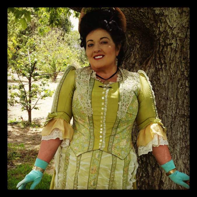
Karin Camille Picnic Dress

Karin Camille Picnic Dress Impressionist

Karin Camille Picnic Dress

From a color theory standpoint, the colors that we ultimately used for the Camille picnic dress were: chartreuse (both pale and bright), pale champagne gold (on the lower sleeves), and yellow-orange (the fringed trim running on the skirt front):

Image result for bright chartreuse pantone

Image result for old gold pantone

Image result for bright orange pantone

Finally, if viewed on the color wheel, you will notice that they are all analogous colors that are located next to each on the wheel:

color-wheel-300

We hope you’ve enjoyed that this post has helped give you some insight into just one of the many elements that go into making a Lily Absinthe design. Stay tuned for more!

Introducing The Camille

Since its introduction, our Camille dress design has been a major hit with our clients and has become one of the mainstays of our day dress line-up. The Camille is based on the Mid-Bustle Era styles that the Impressionist models would wear, primarily characterized by a fitted, narrow tied-back skirt that is swagged, pleated, and ruffled with fullness from the knees down. This style was also made popular by the famous actresses of the time such as Lilly Langtry and Sarah Bernhardt. What also makes this skirt more distinct is the custom bayleuse which is installed in each of our dresses which serve to create the distinct silhouette that characterized the late 1870s/early 1880s.

Camille Dress Elena

The Camille is a solid design that is suitable for a variety of occasions, both indoor and outdoor, and is available in a nearly endless combination of colors and fabrics. Below is one example that we recently made for a client:

Camille Dress Elena
With this dress, we’ve employed a blue color palette with a solid light blue foundation for the basic skirt and bodice sleeves and  combined it with dark blue cuffs and lapels on bodice. Then, just to make things interesting, we also employed a blue plaid fabric for the bodice body and swaged overskirt with pops of yellow. Finally, to complete the effect, we used a shirred white net to cover the upper underskirt.

Here is a three-quarter view of the rear of the dress. The underskirt is covered with shirred white net from the top to mid way down, and then with three rows of pleating from mid way down to the hem.

Camille Dress Elena
Below is a closer look at the hem- three rows of pleating…
Camille Dress Elena
Here are some more views of the dress details:

Camille Dress ElenaCamille Dress Elena

Now let’s take a look at some bodice details:

Camille Dress Elena

The bodice incorporates features reminiscent of 18th Century styles to include an inset of shirred white net framed by dark blue lapels or revers, creating a faux waistcoat appearance. The sleeves are three-quarter length ending in cuffs that match the lapels trimmed with three buttons. To finish it off, each sleeve has inset lace with silk ribbon trim.

Below is a close-up of the sleeve and cuff (before the lace was added). This is a good illustration of the color palette:

Camille Dress Elena

Overall, the effect is an interesting mix of plaid and solid-colored fabrics with a palette that harmonizes. The shirred front overskirt, knife pleats, and folds create an uneven texture that contrasts with the smoothness of the bodice and sleeves. The design was definitely a hit with our client and we look forward to creating more dresses in this style.

Flying Out…

Once again I’m at LAX waiting for my flight to Tucson…this time, it’s back to Tombstone for the Tombstone Territorial Days event. 🙂 It seems that Southwest Airlines is seeing a lot of me these days and with in-flight meals like this, why not? 😉

20170915_193038

See  you all out there!