The Czarina Of Dress – A Look At Jeanne Paquin, Part II

Maison Paquin

Beraud, Jean (1849-1935), Workers Leaving Maison Paquin, c. 1900; Musee de la Ville de Paris, Musee Carnavalet.

In our last post, we discussed Mme. Paquin’s early years as a couturiere in the 1890s. However, it was not until the early 1900s that she began to come into her own and in this post, we’ll be taking a look at this period. During the early 1900s, Paquin’s fashion house grew in stature, aided by her husband’s business acumen, she proved to be an expert marketer, frequently utilizing publicity stunts to attract public attention. More importantly, Paquin made an extra effort to cater to her clients’ needs, taking into account their personalities and preferences; this was in contrast to the aloof approach taken by some of the other fashion houses such as Worth and Poiret who tended to operate on the “we know what’s best for you and you’ll like it” principle.

Paquin’s working style was noted at least as early as 1896 as detailed in the March 22, 1896 issue of the Los Angeles Herald:

Ask Paquin to make you a dress, and say “What shall I have?” Does this clever artist recall a gown worn by Empress this or Queen that, or Actress So-and-So, and say such and such a thing “would be pretty.” Not at all. Your figure is taken into consideration in selecting rough or smooth, large pattern or plain goods. Your eyes, hair and skin are considered In selecting the chief color. Then with a roll of the warp printed silk for a cue, Paquin will coil a twist of one color about it. and then another, and the harmony and contrast are decided upon, end when you are clothed in the result of this cogitation you go forth In the nearest degree to a right mind on the subject of dress that you have ever had likely.

In terms of design, Paquin was also solidly grounded, using a combination of color, light, and texture to create dazzling effects. Many of her designs were inspired by Oriental influences or by previous historical eras and many of her designs were novel that combined various fabrics and trim in unexpected ways. At the same time, Paquin was also practical, incorporating elements in her designs to give women greater mobility such as the use of hidden gussets in hobble skirts to allow greater leg movement.

Paquin’s stature was such that in 1900 she was elected as the President of the fashion section for the 1900 Exposition Universelle and later was honored by the French Government with the Legion of Honor in 1913.

Paquin_Worlds Fair_1900_1

Paquin Display, 1900 Exposition Universelle(© Léon et Lévy / Roger-Viollet)

Paquin_Design_1900

Fashion Sketch For A Ball Gown, Paquin, 1900; V&A Museum (E.334-1957). This was one of a number of designs created by Paquin for the 1900 Exposition Universelle

Below are some representative examples of Paquin’s designs during the early 1900s. First we start with some day wear:

1979.346.27ab_F

Day Dress, Paquin, . 1905 – 1907; Metropolitan Museum of Art (1979.346.27a, b)

1979.346.27ab_B

Three-Quarter Rear View

69.149.11a-c_threequarter_front 0002

Afternoon Suit, Paquin, c. 1906 – 1908; Metropolitan Museum of Art (2009.300.1350a–c)

69.149.11a-c_back 0002

Rear View

69.149.11a-b 0002

View without the jacket.

And now for some formal styles such as these two 1895 vintage ball gowns:

Paquin Ballgown 1895

Jeanne Paquin, Ballgown, 1895; Metropolitan Museum of Art (2009.300.2115a, b)

Paquin Three Quarter Rear View

Three Quarter Rear View

Paquin 1895

Jeannie Paquin, Ballgown, c. 1895; Staatliche Museen Berlin (2003,KR 424 a-c)

Looking at the above two examples, they’re essentially the same design only with different fabrics and trims. In terms of design, both are relatively simple although the second one is more elaborate with a beaded pattern continuously running on both the skirt front and the rear skirt/train.

Moving forward to 1900, we see another of Paquin’s designs:

Paquin Ballgown 1901

Jeanne Paquin, Ballgown, 1901; Metropolitan Museum of Art (C.I.53.32.3a, b)

Paquin- Skirt

Close-Up Of Skirt

Design-wise, we see a continuation of the earlier 1890s style. The skirt and bodice are constructed of an ivory silk satin covered with a beaded floral motif and supplemented by yellow silk velvet ribbons and white lace which all combine to create a three-dimensional effect.

And in 1904, we see a drastic reduction of the train in this evening dress:

Jeanne Paquin 1904

Jeanne Paquin, Evening Dress, 1904; Metropolitan Museum of Art (C.I.39.112.2)

Jeanne Paquin 1904

Side Profile

Unfortunately, examples of Paquin’s earlier work are not abundant to it’s hard to get a complete picture of where she was going design-wise. Compared to Worth or the other leading designers, her designs are relatively simple (and I use this term loosely) but nevertheless betray a certain elegance. In future posts, we’ll be showing examples from later years which reveal some amazing details that set her apart from other designers.

(To be continued…)

Design Elements – Color Sets The Mood

One of the key elements in fashion design is color and late 19th Century fashion design is no exception. The design process may vary between individual designers but no matter who they are, they all have to consider what colors they’re going to use in their designs. The selection of colors is dependent on the season (though not always) and as such, tend to follow nature. Today, heavy weight is given to predicting what colors will be popular with fashion consumers because this influences the color and types of fabrics that design houses will order for their new lines; a multi-million dollar industry has been created around predicting what colors will be in for the following year with Pantone being the leading firm because of it setting color standards for a variety of industries.. The following color palettes from Pantone give a good illustration of this:

First we have the palette for Fall 2017:

PANTONE Fashion Color Report Fall 2017, New York

Most of the colors are deep, darker earth tones with a neutral gray mixed in reflecting shorter, darker days, leaves turning and the dying off of plant life in anticipation of winter. Nest, here’s the palette for Spring 2018:

Image result for pantone colors fall 2018

In the above palette for 2018, the colors tend to be lighter, reflecting the increasingly longer days, more sunny weather, and new growth of plants and foliage.

However, before we go on, let me emphasize that color trend predicting is a somewhat subjective and as such, it doesn’t always follow strict rules and as such, it’s more of an approximation today than it was during the 19th Century. Here are two examples from the late 19th Century:

As with other designers, consideration of color makes up a good part of the design process and it’s one of the first steps in the design process. For us, colors fall under three major categories: Fall, Winter, and Spring/Summer. At the same time, we also consider what sort of a garment we’re designing: ball gown, day dress, reception dress, etc. Also, we consider where it’s primarily going to be worn: outside, indoors, indoors at night (e.g., ball room, stage, etc.). Once those questions are answered, we can then proceed with more specific color selections. If the garment is to be worn during the daytime and outside, we tend to first use nature as the first starting point for inspiration.

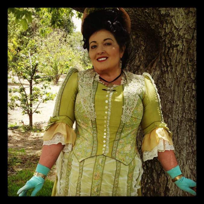
To illustrate this, let’s consider our Camille picnic dress design. When we originally conceived of it, we were looking for a day dress that could be worn at an outdoor event in the Spring or Summer such as a picnic. The Mid-Bustle Era has always been a favorite with us, so we decided that the style would derive from that period. From there, we determined our color palette, drawing inspiration from the Impressionist painters and Claude Monet in particular. But even more specifically, we wanted to emphasize the Spring with its fresh vegetation and explosion of lighter green colors combined with occasional pops of red or violet and towards that end, Monet’s garden at Giverny was the perfect source of inspiration.

After some online photo research, here’s what we came up with:

Karin Camille Mood Board Spring 2016

Ultimately, the decision was made to go with a bright chartreuse as the primary color based on the greenery found at Giverny that’s portrayed with in Monet’s paintings as well as actual photographs such as this one:

Giverny Monet

Giverny Today

Below are a few more illustrations of the final Camille picnic dress just to give an idea of how the color was ultimately brought to life:

Karin Camille Picnic Dress

Karin Camille Picnic Dress Impressionist

Karin Camille Picnic Dress

From a color theory standpoint, the colors that we ultimately used for the Camille picnic dress were: chartreuse (both pale and bright), pale champagne gold (on the lower sleeves), and yellow-orange (the fringed trim running on the skirt front):

Image result for bright chartreuse pantone

Image result for old gold pantone

Image result for bright orange pantone

Finally, if viewed on the color wheel, you will notice that they are all analogous colors that are located next to each on the wheel:

color-wheel-300

We hope you’ve enjoyed that this post has helped give you some insight into just one of the many elements that go into making a Lily Absinthe design. Stay tuned for more!