Setting The Mood With Color

We wrote this post a few years ago but we believe that it still holds true. Color has always held a fascination for us and it’s a key element in the design process. And just for interest, here’s the Pantone Color of the Year for 2020: 😁


One of the key elements in fashion design is color and late 19th Century fashion design is no exception. The design process may vary between individual designers but no matter who they are, they all have to consider what colors they’re going to use in their designs. The selection of colors is dependent on the season (though not always) and as such, tend to follow nature. Today, heavy weight is given to predicting what colors will be popular with fashion consumers because this influences the color and types of fabrics that design houses will order for their new lines; a multi-million dollar industry has been created around predicting what colors will be in for the following year with Pantone being the leading firm because of it setting color standards for a variety of industries.. The following color palettes from Pantone give a good illustration of this:

First we have the palette for Spring 2018:

Image result for pantone colors fall 2018

Just for comparison, here’s the Spring 2020 Color palette (in some ways, it seems to be a close re-rum of the 2018 palette):

In the above palette for 2018 and 2020, the colors tend to be lighter, reflecting the increasingly longer days, more sunny weather, and new growth of plants and foliage.

However, before we go on, let us note that color trend prediction is a somewhat subjective and as such, it doesn’t always follow strict rules and as such, it’s more of an approximation today than it was during the 19th Century. Here are two examples from the late 19th Century:

As with other designers, consideration of color makes up a good part of the design process and it’s one of the first steps in the design process. For us, colors fall under three major categories: Fall, Winter, and Spring/Summer. At the same time, we also consider what sort of a garment we’re designing: ball gown, day dress, reception dress, etc. Also, we consider where it’s primarily going to be worn: outside, indoors, indoors at night (e.g., ball room, stage, etc.). Once those questions are answered, we can then proceed with more specific color selections. If the garment is to be worn during the daytime and outside, we tend to first use nature as the first starting point for inspiration.

To illustrate this, let’s consider our Camille picnic dress design. When we originally conceived of it, we were looking for a day dress that could be worn at an outdoor event in the Spring or Summer such as a picnic. The Mid-Bustle Era has always been a favorite with us, so we decided that the style would derive from that period. From there, we determined our color palette, drawing inspiration from the Impressionist painters and Claude Monet in particular. But even more specifically, we wanted to emphasize the Spring with its fresh vegetation and explosion of lighter green colors combined with occasional pops of red or violet and towards that end, Monet’s garden at Giverny was the perfect source of inspiration. After some online photo research, here’s what we came up with:

Karin Camille Mood Board Spring 2016

Ultimately, the decision was made to go with a bright chartreuse as the primary color based on the greenery found at Giverny that’s portrayed with in Monet’s paintings as well as actual photographs such as this one:

Giverny Monet

Giverny Today

Below are a few more illustrations of the final Camille picnic dress just to give an idea of how the color was ultimately brought to life:

Karin Camille Picnic Dress

Karin Camille Picnic Dress Impressionist

Karin Camille Picnic Dress

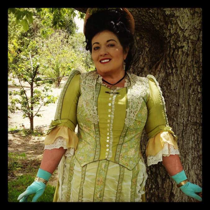
From a color theory standpoint, the colors that we ultimately used for the Camille picnic dress were: chartreuse (both pale and bright), pale champagne gold (on the lower sleeves), and yellow-orange (the fringed trim running on the skirt front):

Image result for bright chartreuse pantone

Image result for old gold pantone

Finally, if viewed on the color wheel, you will notice that they are all analogous colors that are located next to each on the wheel:

color-wheel-300

We hope you’ve enjoyed that this post has helped give you some insight into just one of the many elements that go into making a Lily Absinthe design.


Happy Birthday Charles Worth!

Happy Birthday Charles Worth! Born October 13, 1825, Charles Worth was a pioneer in the development of the fashion industry and laid the foundation for many key details of the fashion world that survive to this day. In commemoration of the day, albeit belated, here’s an interesting circa 1878 reception dress he created: 🙂

Worth, Reception Dress, c. 1878; FIDM Museum (2006.25.2AB)

This skirt and base bodice of this dress is constructed from a black silk velvet combined with sleeves of a dark gold covered in black lace with black beaded passmentarie. More black beaded passmentarie covers the front skirt and bodice front. Below is a close-up of the front bodice:

And here’s a view of the rear upper shoulders and neck:

And here’s a rear profile view:

In terms of the age of the dress, it would appear that the skirt is fuller than what would be expected for a natural form/Mid-Bustle Era dress silhouette. Also, the bodice  hem appears to be riding high on the hip, something that was done to optimize the drawing of the train to the rear through use of a bustle. Of course, it could also be a matter of staging, without viewing it in person it can often be hard to tell. Time-wise, we’re inclined to place this one more towards 1875-1876. Well, hopefully we’ll one day have an opportunity to view this dress in person but in the meantime, enjoy the pictures and once again, happy birthday Charles Worth!


Some Commentary on Walking Dresses & Walking Suits From the 1880s

O

ne of the more interesting styles to develop during the 1880s was the walking suit/walking dress and they were both practical and stylish, incorporating both a wide variety of cuts, fabrics, and colors and were intended for wear while out in public. Just to preface, from what we’ve seen in the research we’ve done, the terms “walking dress” and “walking suit” seemed to be used somewhat interchangeably and it doesn’t appear that the concept was fully formed until the early 1890s with its characteristic jacket-waist-skirt combination. However, looking at this style in the 1880s, it would appear that first and foremost, the skirt was untrained and the hem tended to be a off the ground. Also, to a great degree, the bodice tended to be styled as a “jacket-bodice” in which the bodice was constructed to mimic a jacket over a visible vest or some sort of decorative treatment- often shirred chiffon. But, as mentioned above, the concept doesn’t seem to have been fully formed and the boundaries could get hazy at times (no doubt influenced by marketing concerns since much of the fashion press of the times was owned by various pattern-making concerns such as Butterick).

File:Woman walking, carrying a child and turning around; another child holding on to the woman's dress (rbm-QP301M8-1887-052a~11).jpg

The walking dress in action…

What ultimately became the distinct walking suit of the 1890s seems to have gotten it’s start by 1884 as a walking dress that was meant as a more practical garment. Below is some commentary from the December 1884 issue of Demorest’s Family Magazine:

In opposition to these dazzling house toilettes are the sober, neat street costumes which are almost universally worn. The material is usually some dark shade of cloth. Heavy serge and bure, a thick worsted goods with a coarse, shaggy surface, are especially popular for walking suits. The skirt is almost plain, simply a plaiting around the bottom, but a broad band of fur encircles it about a quarter of a yard from the bottom. A full overskirt drawn up high over the hips, and a little tight fitting fur-trimmed jacket complete a costume rich in its quiet simplicity. To be worn with it is a little bonnet fashioned from the same material, with plume 3 or tips of some contrasting color and velvet strings.

One suit is of dark-brown cloth, the skirt consisting of bayadère stripes {fabric]1A fabric with bayadère stripes is a fabric with horizontal stripes in strongly contrasted colors. of a lighter hue mingled with a grayish blue traversing the ground. No trimming except the foot plaiting of plain brown. Drapery and corsage are also of plain brown. The latter opens at the side beneath the full plaits of the waist proper so as to leave the striped vest unbroken in front. Cuffs and close collar are of the striped goods, and a band of the same about two inches wide reaches down the shoulder seam from the collar to the insertion of the sleeve.

The above passage defines the walking outfit as streetwear that is plain with an emphasis on darker colors and plain woolen fabrics. Skirts are meant to be simple and untrained with a minimum of gathering. At the same time, it’s noted that that the underlying vest is somewhat more colorful and loud and that the bodice is to be arranged to show it off to the best advantage. Finally, it must be noted that the skirt could be in a contrasting material, striped in the above example. The above points are further discussed in this passage below from the same issue:

The newest winter walking suits consist of skirt, jacket basque, and vest, real or simulated, and street-coat or cloak. The walking-jacket is not at all so indispensable a part of them as formerly. The jacket-basque, with vest, is cut in such a way that it completes a dress fit for the street; and when the temperature demands additional clothing, a longer, more protective. and adjustable garment is found necessary to meet varied requirements.

This is really an improvement, but a greater one is the getting rid of looped and bunched-up drapery from heavy cloth materials. “Tailors” proper—what are known as “ladies’” tailors—would have served a really good purpose, if they had strictly adhered to the original idea, maintained a certain standard, and not endeavored to copy the follies of tulle in solid cloth.

Redfern, the great Isle of Wight tailor, has done this less than others. He gets up astonishing contrasts in colors; his “yachting ” suits, his “men of war” costumes for girls, and his cloth “gowns,” are original and striking, but they are useful and suitable; his coats are full of inside pockets, and his traveling costumes seem made for the “road” and to have a satchel, or lorgette slung across them.

The above comments on Redfern are also interesting in that we see tailors trying to incorporate elements in their work that are more in the area of dressmaking, much to Demorest’s disapproval. Below is an illustration from the April 1885 of Demorest’s that illustrates some of the ideas expressed in the above passages in regard to the utility of the walking suit/walking dress. In the right figure, the skirt is simple with a minimum of gathering and the pattern provides a nice contrast to the solid colored skirt front and bodice sides and back. The jacket/bodice is also faced in the same material as the underskirt and helps create the appearance of a long waistcoat reminiscent of early 18th Century styles.

And just to show some of the variations in jacket/bodice styles, here’s another illustration, this time from the May 1885 issue of Demorest’s:

And lest we think it was just Demorest’s that was presenting this style to the public, below is an illustration below from the October 1886 issue of Peterson’s Magazine:

Below are some extant walking dresses from the 1880s, starting with this one from circa 1885:

Walking Dress, c. 1885; Metropolitan Museum of Art (1978.295.8a, b)

And below is another example from circa 1884-1885; and yes, it’s labeled as being a day dress and that’s true but it also encompasses elements of the walking dress style.

Day Dress, c. 1884-1885; Museum of London (32.26/2a)

Finally, we have this circa 1885 walking dress from Worth:

Worth, Walking Dress, c. 1885; Metropolitan Museum of Art (2009.300.771a, b)


A Pingat Day Dress- Circa 1880s

P

ingat is not a name people today associate with dress styles. Sure his atelier made them but in today’s fashion literature, he’s more associated with outerwear than anything else. Recently, we came across some interesting pictures of a circa 1880s Pingat day dress that was sold on an auction site:

We were unable to obtain more high-resolution pictures but they’re still detailed enough to get a good idea of the style. First though, we wanted to try and date this a bit more specifically than simply being “1880s”- auction websites are notorious for poor dating. Based on the dress silhouette, our best estimate would be the 1881-1884 time frame. The rear skirt has some fullness in the back and the bodice back is also shaped to further accentuate the skirt’s fullness. However, at the same time, the skirt’s fullness doesn’t read “large” like what one sees with late 1880s skirts; of course, a lot of this comes down to staging and it would be interesting to have seen what sort of bustle the skirt could accommodate. At the same time, the skirt just doesn’t read the natural form/mid-bustle era style characteristic of the 1877-1881 time frame. Also, it must be noted that the bodice doesn’t completely cover the hips, which also tends to support the mid-1880s time frame. In the end, we’re going to qualify this all with the usual “our best guess” disclaimer. 🙂

As for the dress itself, it appears to have been constructed from a blue-striped white/ivory silk satin with no extra trim- it could have had some lace but if so, it’s long gone. The above picture of the label gives a nice close-up view of the fashion fabric. Below are close-up pictures of the bodice front and back:

The collar just seems to naked without some lace… 🙂

This dress is hemmed with two rows of knife pleating of fabric that’s similar to the fashion fabric only that the stripes appear to be more closely spaced together. It’s also an interesting effect having the knife pleating stripes running perpendicular to the fashion fabric stripes. Finally, separating the two rows of knife pleating is ruching. Viewing the dress at a distance, one cannot help but a bit disoriented by all the striping running in different directions. 🙂

This is a very nicely designed day dress and it could have even worked for a reception dress. However, the most interesting part about this dress is that it was actually a combination day/evening dress as can be seen from this evening bodice:

Unfortunately, there are no other views of the night bodice so we don’t know much but judging from the voluminous lace running down the back, it’s clear that the night bodice was intended to provide a contrast to the more tidy day bodice. Maybe one day some more pictures of the night bodice will surface. Overall, this is an interesting dress and it uses stripes to maximize its impact while at the same time, the optical effect of the stripes is a bit jarring. We hope you’ve enjoyed a view of this very unique dress.


Patterns…

T

oday’s theme at @redthreaded is “patterns” and this is a fun topic for me! I usually get an eye roll from others when asked: ” What pattern did you use?” Because this is where we begin…from original sources. A little bit of math, science, and creativity. Some of them are gorgeous works of art, some are mechanical, many have fiddly different rulers. Enterprising seamstresses knew how to use these to translate spidery lines into fitted garments. The Victorians were smart! We like to nerd along with them. 🙂