
My most peaceful Sunday requires silk, lace, gentle handwork…and Mozart.
My most peaceful Sunday requires silk, lace, gentle handwork…and Mozart.
Today Lily Absinthe went on the road to Oro Grande, California to attend the 2nd Annual Oro Grande Days, a small Western-themed event centered on the local history of the town and immediate area. Located along the Mojave River between Victorville and Adelanto, Oro Grande was originally founded as a mining town in January 1881 as a result of a series of silver strikes in the surrounding area (the town was originally named Halleck). While it lacked the notoriety of other mining towns of the period, it played a role in the initial settlement of the area and illustrates the key role that mining played in the settlement of the West. Another interesting fact is that Route 66 and the Union Pacific Railroad passes through Oro Grande.

For us, this is an area that we have never seen before and it perfectly symbolizes how the American West grew- it wasn’t flashy and there were no famous gunfights but rather it illustrates how mining was one of the key economic activities that joined the American West with the rest of the nation. We tend to associate mining in the American West with hordes of prospectors panning for gold in streams or digging holes in the desert but this was not really a true picture. Mining was a large-scale industrial activity requiring large amounts of capital to finance the construction of the massive infrastructure necessary to profitably mine not just for gold, but also for silver, copper, and a host of other materials. In fact, although gold gets most of the attention, it was more basic metals such copper, lead, zinc, et al. that were the foundation of the mining industry.
While mining was the foundation for the town, it was the 2nd Annual Oro Grande Days event that drew us to Oro Grande. Invited by a good friend to help judge a costume contest, we jumped at the opportunity to travel somewhere that we’d never been to before. The weather was overcast, cool, and windy with rain threatening at any minute but we were not deterred and fortunately, the rain held off. Due to the threat of rain, attendance was somewhat reduced and the contest itself went a lot faster than we expected so we found ourselves mostly socializing with a number of old friends and otherwise enjoying a day outdoors, away from the atelier.
Below is a picture from the event:

Here we are with our good friends Ms. Odessa Red and Ms. Maria Rosey Stroup.
We had a good time and the event organizers went out of their way to make us feel welcome. We hope to return again in the future. 🙂

And here I am modeling my latest sporting outfit.
In keeping with the theme of fashion inspiration and design, we present a short overview of the process applied to a picnic gown, narrated by Karin. With the coming of Spring, comes longer and warmer days and the opportunity to get outdoors and enjoy those days. 🙂 Picnics are a favorite with us because they give us an opportunity to wear our designs in a relaxed atmosphere (balls are fun too, don’t get me wrong) and we just naturally associate it with Impressionist picnics. 🙂

Claude Monet- “The Artist’s Family In the Garden” (1875)
With the arrival of spring, vegetation begins to flower in a riot of color and that is where we find our inspiration. As we noted in a previous post, greens are a special favorite with us but they’re not the only favorite…

There is a host of other colors to include shades of blue, red, magenta, pink, and lilac…

Lilac is one of those easily overlooked colors but it struck a responsive chord with us. We’ll let Karin continue the story…:-)

..
It’s no secret, I have a thing for sheer frothy summer picnic gowns straight from an Impressionist painting. My favorite lilac summer gown started with every intention of being “that white Met dress” that I have a crush on:

The original gown inspiration from the Metropolitan Museum of Art website. It has three of the four “food groups” that interest me with gowns: pleating, ruffles, shirring, ruching…guess which one this one doesn’t have. 🙂 Pleating…mine will have it.
However, the moment I announced that I was going to make this gown on Facebook, a friend of mine posted that she was going to use this same cotton batiste! Thus, the evolution began…so I decided to dye it.
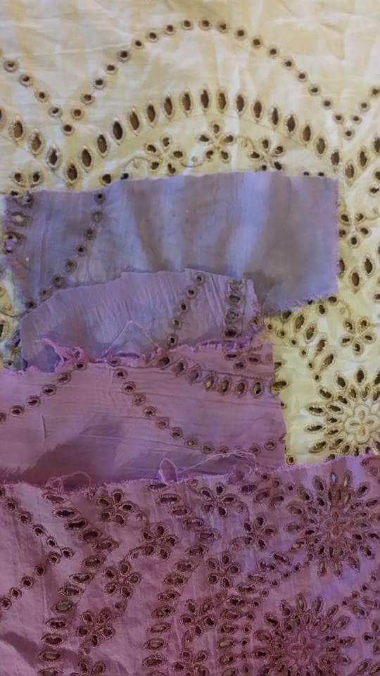
First, the lilac rinse. The top of the sample has been left plain:

Everything came from my work studio and was carefully dyed to harmonize and not match. This is how to create depth so things don’t appear to be flat.

Vintage fabrics have stories to tell. This vintage eyelet came from a Lid family friend’s chalet in Switzerland (and some stories, I’m sure!) It took over four sheet dips of color to get the right shade. I’ve been carefully using this gift of fabric over the years and there are only two meters left.
Second and final color later and silk ribbons to match, because…you never know, right? Color is clear and not muddy, not an easy thing to do. I’m an artist myself and as such, I usually get ideas from other painters…Tissot is one of my favorites. 🙂

Foundation skirt front, very girly with both micro pleats, shirring, and ruffles, book is showing my inspiration dress. That’s a lot of narrow hemming! Et voila…

Lilac summer gown (the first version) standing next to my W&G treadle machine that I made the hat with. The gown (like most of mine) will eventually evolve. This version had no collar, just an antique piece of lace slipped in the piped neck edge and after wearing it once, I hung it up and told Adam:
A re-direct was required. I like the next version much better…

Final version with a shaped velvet edged lapel that is curved to fit over the bust with no ruffles…more tailored, much better! The difference is that it’s now balanced visually, nothing “floats” near the face, which is better for me. I’ve learned to say “never say never”…

Summer gowns and stagecoaches? Count me in! See how the collar curves with the bust? That has to be done with a curved neck edge (on the lapel) slipped onto a straight neckline. I like that much better. 🙂

Of course, the garden photo Rancho Los Camulos…matching the bougainvillea was a happy surprise. <3 Monet would approve.
And now, back to Adam…
So there you have it, straight from the designer herself- often the design process takes various twists and turns, sometimes in response to a change in conditions or sometimes as simple as someone else is looking to create a similar dress. Also, a chance encounter with a specific piece of fabric or variable dye results can send the design process spinning in an unanticipated direction. In short, it’s not a mechanical process as one would find with designing a car or an airplane: it’s more art than science. But also note that “design” is not the only factor at work here; it’s also essential to have an understanding of how garments are constructed and the interactions between textiles, dyes, and construction.
Fashion plates, original images, and extant examples are all useful (and essential) but unless one understands what is going on “under the hood”, so to say, the end results will not be optimal. The design process is a bit more complicated than one would initially think but at the same time, it’s not magical and mysterious (no matter what some designers will claim). The key is diligent study and constantly being open to new possibilities and have a willingness to learn new techniques.
We hope you’ve enjoyed this excursion through the design process here at Lily Absinthe and we’ll be commenting more on this topic in future posts. 🙂
The natural world has always been a source of inspiration for artists and fashion designers and the late 19th Century was no exception. Examples of natural inspiration in fashion abound but there were a few specific examples that caught our eye.
The first example is a ballgown created by the House of Worth in 1898 (Frederick Charles Worth himself has passed from the scene by this time) and it incorporates butterflies as a design motif:

Ballgown, Worth, 1898; Metropolitan Museum of Art (2009.300.1324a, b)

Three-Quarter Front View

Rear View

Three-quarters view of skirt.


This dress has a relatively simple, clean silhouette characteristic of late 1890s design. The skirt itself is made from a pale blue silk satin and has a full train and an unadorned hemline. The bodice is constructed of the same pale blue silk satin trimmed in a taupe silk chiffon. All of this is fairly standard but what separates this dress from others is that it’s decorated with butterflies on the skirt and bodice, are arranged to give the appearance that they are fluttering away from the hem.
The butterfly decorations appear to be of champagne/gold with metallic highlights and black beading; most notably, they’re woven into the fashion fabric rather than appliqued. Even more remarkable is that the butterflies are scaled, shrinking in size moving away from the hem- the fabric was deliberately woven this way, and there’s little doubt that there were “up” and “down” sides of selvage; this fabric was specifically commissioned by Worth. Worth sourced most of its silks on a custom-production basis from various firms in Lyon, France and the results were amazing such as in this case.
As a sidelight, what is even more remarkable about the butterfly fabric is that its width would have had to have been wide, no doubt approaching the 54 or 60 inch wide. 54 to 60 inch widths for fabric are standard in the textile industry today but that was not the case in the 19th and early 20th Centuries. Then, fabric widths tended to be narrow, ranging from 30 to 40 inches wide (or the metric equivalent thereof). In our collection of vintage bolts of fabric, none are wider than about 34 inches.
This “natural” theme can be also be found in this ball gown that was also designed by Worth in 1900, only this time incorporating wheat-like motif:

Ballgown, Worth, 1900; Metropolitan Museum of Art (2009.300.1250a, b)

Side Profile

Skirt Detail

More Skirt Detail
And here it is being “worn”:

The silhouette is identical to the first dress only the basic fashion fabric for skirt and bodice is now a pink-colored silk satin. The skirt is decorates with a series of wheat stalks flowing upwards from the hem both on the front and the back. It is difficult to tell from the pictures if the yellow/gold wheat stalks were integrated into the basic fashion fabric (we suspect it is) but combined with the beading, the effect is imaginative. The pink color of the dress is further enhanced by the taupe/gold chiffon and fabric flowers that trim the neck and shoulders of the bodice. Once again, we see the natural world as interpreted into fashion.
As a side note, the above two ballgowns illustrate one of Worth’s basic design methods in that each dress was based on a standard pattern block that was modified for the individual client. At root, the construction details for each type of garment remained fairly similar, only the fabrics, decoration, and trim varied. From a business perspective, it was efficient-no point reinventing the wheel, so to say, each time a client ordered a dress. It’s also easily overlooked with all the distraction caused by the exquisite fabrics and trim found in Worth’s designs (the goal of every designer of the time 🙂 ). We hope that you’ve enjoyed this little excursion to the House of Worth. 🙂
“>
Skirt assembly day…it’s starting to look a bit “pleatastic” as our latest spring design as it takes shape in the atelier:


This dress will utilize a combination of color and textures to create a bold spring effect evocative of the lush vegetation that comes out once the Winter’s cold makes its retreat. This dress is just the thing for picnics and other outside activities.

This would be the perfect dress for a picnic here at Giverny: 🙂

And in answer to the often-asked question of where our inspiration comes from, all we can say is that the source is sometimes as close as the garden out in back 🙂 :


Stay tuned for further updates on our new designs. 🙂