In the fashion world, garments are typically designed six months or more in advance of their intended release date. While we are not as tightly bound to advance deadlines as many fashion entities, we still find that a six-month lead time to be useful as a planning tool. Right now, our thoughts are on Spring 2017 and especially when it comes to color. Color is one of the basic building blocks of fashion and when combined with various types of fabrics, we have the foundation for specific designs.
Color’s importance can not be understated and there are a multitude of entities providing color trend analysis services to the fashion industry (along with predictions of trending fabrics and fashion styles). One of the leading entities is Pantone and here’s what they’re predicting for Spring 2017:

Now, bear in mind that this is not meant to be a comprehensive list and other colors can also be employed- it’s only meant as a broad estimate rather than anything specific. However, in looking at the above color palette, one can see that the colors are somewhat restrained and leaning towards pastels with higher value and low saturation.
For us, we tend to start our color analysis by looking at nature and at present, these are some of the colors that we envision:


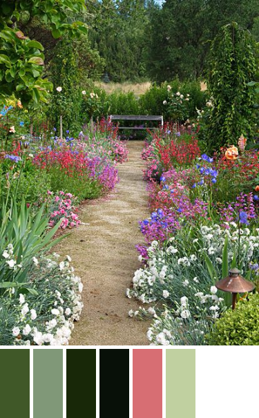
As you can see, there’s quite a range of colors there, mostly shades of green and all of them muted. However, bear in mind that these are the products of computer rendering so the final product will be somewhat different when applied to various fabrics. 🙂
This is just one of the first steps in the design process but it’s an important one because it impacts the other design elements. In future posts, we’ll be showing more about the design process and how it contributes to our creations. Stay tuned! 🙂